Ocean Conservation: Analytics for Corals

In 2024,
I volunteered to support a coral conservation project by helping them address their data and analytics challenges.
The opportunity arose during a serendipitous conversation about data and analytics with Jake Levenson, the founder of Oceans Forward, on a whale-watching boat in Dominica. Jake shared my enthusiasm for data storytelling and beautiful visualisations but lacked the resources and experience to implement them for the various ocean conservation projects his NGO was running.
He then connected me with Simon Walsh, who runs a scuba dive shop in Soufriere, where I train freediving. I had known Simon for a year, and we were friendly, but we never discussed the specifics of our work. I knew Simon as the guy who owns the scuba dive shop and contributes significantly to the local community, including running coral conservation initiatives, and he knew me simply as "Susie the freediver."
So when Jake “re-introduced” me to Simon as the “analytics genius” and enthusiastically asked me to show the dashboards of my personal projects (like my freediving dashboard, theatre visits dashboard and so on), I gladly obliged.
And that day became what I proudly remember as the day that I “blew Simon’s mind off” and converted him from someone who cared little about data to a true data champion.
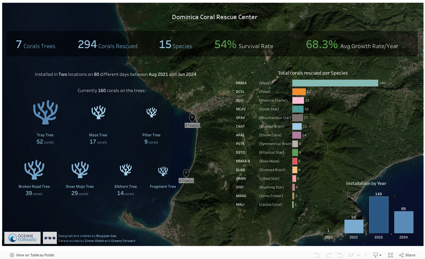
Fast forward a few months, we completed the first analytics project for coral conservation in Dominica.
We built a critical data foundation with new fit-for-purpose data collection processes and data models. We created an interactive dashboard to showcase the progress made with the in-ocean Coral Tree Nurseries. This dashboard provides a beautiful, visual portal for up-to-date summary statistics of the project's progress, helping the team communicate the results effectively and apply for future funding and grants more easily. It also serves as a tool for hypothesis validation, confirming some of the team's impressions while revealing other surprises, such as a higher-than-expected coral growth rate. The team is now more motivated to dedicate time and care to data collection, recognising the powerful stories it will allow them to tell down the line.
“After years of studiously and not very enthusiastically entering data into boring sheets, we have now totally changed out attitude. The visual output in Tableau has become one of our best visual tools and has raised our profile immensely. Now when we pull up the interactive dashboard and review our project with potential grant funders and other coral practitioners, we see their level of understanding and respect multiplied. We have noticed that they want to roll over our statistics to see if our results confirm their own hypothesis.”

The Coral Team, in front of the new Coral Rescue Centre building
You can read the full case study here.
Interactive dashboard below (or see the full version on Tableau Public):